Audi Trademarks New Four Ring Logos In Germany and the US

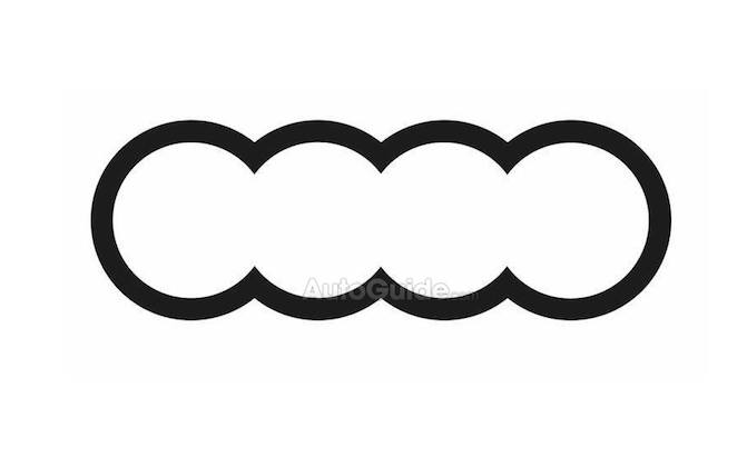
Audi appears to be rethinking its historic “four rings” logo, according to trademark filings our team uncovered. While they don’t give up on the essential idea, they update the interior part of the logo to more fully connect the rings.
We found two potential logos that appear to be playing around with the same idea. The first and simplest just erases the interior links of the logo, creating one long, bumpy ring.
The second does the same while maintaining the central link to create what looks like double mitosis.
While it’s unclear why Audi is considering these changes, we have a couple of guesses. First, Audi could simply be looking to update its logo with a cleaner, less complicated design. Brands have been known to work on their logos through the years and, who knows, this one might even be simple enough to save the company a few cents per unit.
Our second guess revolves around Audi’s work with connected cars. Already pioneering vehicle to infrastructure technology in the US, the brand may be looking to communicate that connectedness on certain cars. By more fully connecting its rings, Audi may be highlighting its technology through the use of a specific logo.
SEE ALSO: Mercedes-Benz EQC vs. Audi E-Tron: Spec Sheet Comparison
The four rings, though, is already rich with symbolism. The rings are a nod to the four brands that came together to make Auto Union. In 1932 DKW, Horch, Wanderer, and, of course, Audi came together to form the company that would go on to build some of the era’s most extraordinary race cars.
Despite being four of Germany’s oldest brands, three of the brands have taken a back seat to Audi and have been largely forgotten. Audi, though, plans to bring back the Horch brand on some ultra luxurious A8s, a nod to the founder of both Horch and Audi, August Horch.
Which leads us to our last guess: Audi may be trying to symbolize the further connections of its four founding brands as it reintroduces Horch and tears down the old distinctions that caused it, Wanderer, and DKW to be lost to pages of history.
But, really, there could be any number of things that Audi wants to express with a new logo. They could want to fill it with script, a la Auto Union, or they could be trying to increase airflow, like the Chevy flow tie. Send us your best guess in the comments.
A version of this story originally appeared Fourtitude.

Sebastien is a roving reporter who covers Euros, domestics, and all things enthusiast. He has been writing about the automotive industry for four years and obsessed with it his whole life. He studied English at the Wilfrid Laurier University. Sebastien also edits for AutoGuide's sister sites VW Vortex, Fourtitude, Swedespeed, GM Inside News, All Ford Mustangs, and more.
More by Sebastien Bell


Comments
Join the conversation
caterpillar look....keep the rings
What was the matter with the other rings logo? That is a simple, elegant, and timeless design well liked and admired worldwide.